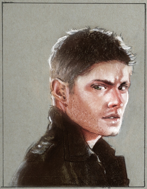
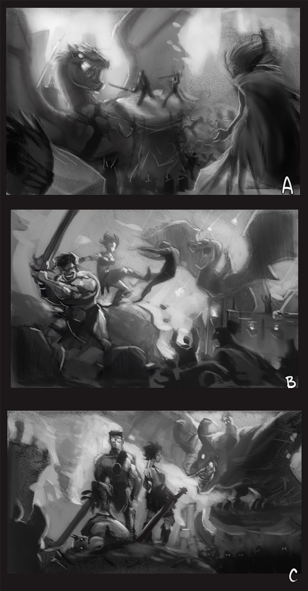
RINTOUL DESIGN
  • Home
  • Portfolio
  • The Metronomicon
  • The Weaponographist
  • Contact & Commissions
  • Services for Content Creators
  • Sketchbook

Digital Sketchbook: Potoo

10/7/2014

0 Comments

 
Picture
0 Comments

Material Studies

6/26/2013

0 Comments

 
After watching Matt Kohr's (http://ctrlpaint.com/) video on material spheres, I realized that I needed to start practicing better surface identification, especially since I've been really focused on different types of lighting lately. To reach that goal, I've created a template that I'll use to make multiple material studies of different surfaces under different lighting conditions.

I realized that I had been depending far too much on photo-textures on any material that wasn't skin or clothes, and so I hope that this will broaden my confidence when painting alternate textures under different lighting conditions.

The other goal of this project is to get better at color sampling visually (no eye-dropper tool allowed) and have a better understanding of the differences in value across multiple surface types.
Picture
Picture
Picture
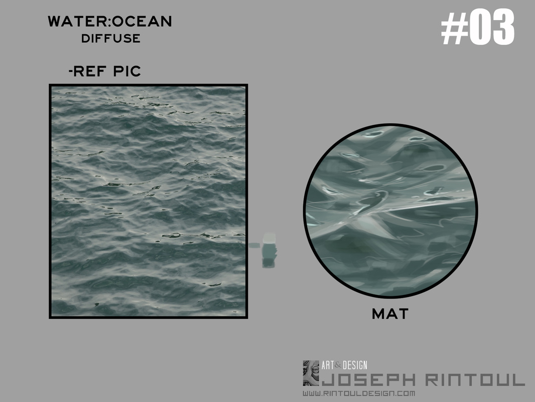
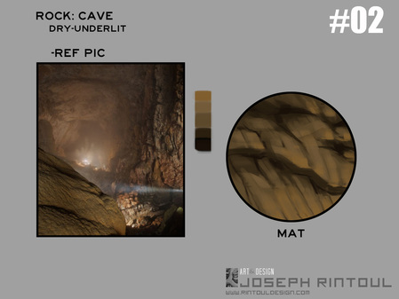
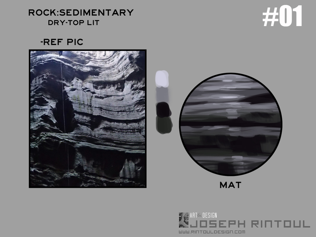
    These are really quite fun to make, especially because I'm able to make them quickly and get a MUCH better understanding of the surface I'm trying to render. If you'd like to use this template for your own material studies, it's available here.

0 Comments

Dalies: 6/24/2013 -Bonus Update!-

6/24/2013

0 Comments

 
Picture
I went ahead and did another attempt at diffuse lighting, and I'm much more satisfied with this version. Also, painting pretty girls is fun. I can see why Vargas did it.
0 Comments

Dalies 6/23/2013

6/23/2013

0 Comments

 
Picture
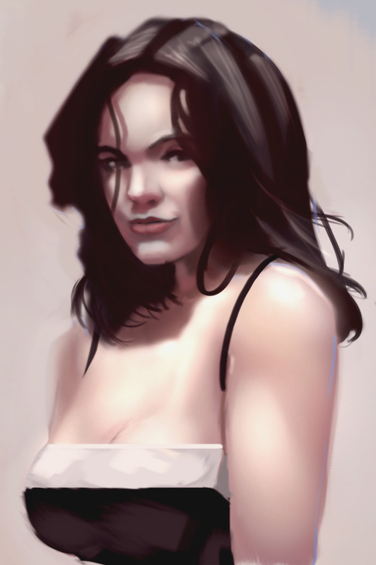
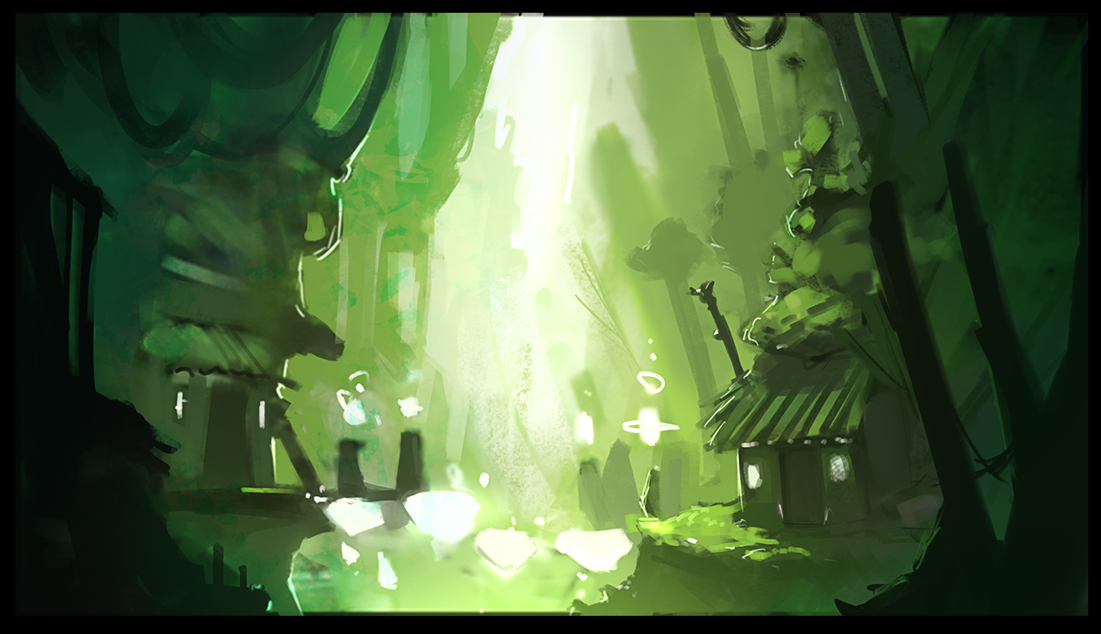
Still playing around with the qualities of light, this time I tried a more diffused light than yesterdays image. I think I still overdid the highlights, and I got away from my initial color ramp during the piece.

However, I am happy with how quickly I was able to produce this image, as well as starting directly with color instead of my usual greyscale to color technique.
0 Comments

Head Study

6/23/2013

0 Comments

 
Picture
Playing around with painting again, this time trying to pay extra close attention to the tonal differences between light and shade in direct sunlight with cast shadows and reflected light. I'm quite happy with this piece so far.

I'm also trying to limit myself from excessively saturated color palettes, as well as limiting the harshness of highlights and speculars for a more diffused, uniform look.
0 Comments

Daily Warm-up: Desert Rider

6/9/2013

0 Comments

 
Picture
I've been trying to work with applying blocks of color directly to the canvas, rather than my more methodical (and often wooden) method of slow sketching followed by blocking in color and renders. I need to tighten up the creature's face, but I'm actually quite happy how the gentleman turned out. I don't know if I'll make this into a finalized version, but I feel it would be fun to do something with these two again.

-J
0 Comments

Dailies: Jan 7

1/7/2013

0 Comments

 
Picture
Here's one of the more comic style pieces that I've done using the template files I discussed earlier to help with color picking and quick renders. It's really proving to be quite useful, especially with quick concepting and colors. What would have taken me much longer originally can now be completed within half that time, with a nice sense of consistency between pieces. It's also proving to be very useful in painting quick good-looking skin-tones, which is one of my favorite things to paint.
0 Comments

New Year Speed-Paint

1/5/2013

0 Comments

 
0 Comments

Brushing off the old inks

11/13/2012

0 Comments

 
Picture
I'm back in studio after a trip to the home-state to relax and see the family. While I was there, I had my basic art supplies, but my main digital setup was left here in studio. The advantage of that however was being able to get back into pencil and pen work. The image to the left is the some of the coloring progress on this image, one of the many done over the course of the vacation. I'm hoping to get it finished fairly soon, I'm really enjoying doing such painted renders over such simplistic line work. Normally, I would have stuck to pure comic style coloring, so it's fairly encouraging seeing a cross over between my comic work and my digital paintings. The finished version of this is definitely going into the portfolio paintings, I think it'll be another milestone.

-J

0 Comments

The importance of Humanity:

9/4/2012

2 Comments


"The aim of every artist is to arrest motion, which is life, by artificial means and hold it fixed so that 100 years later, when a stranger looks at it, it moves again since it is life"   -Faulkner


Picture
Recently, during my coffee in the morning, I've been going through old art books that I own to refresh my memory and see if the lessons I learned from them still hold true. Today's reading is from a gem of a book I purchased a few years ago. It's called "Force: Dynamic Life Drawing for Animators" and it is one of the best books for any aspiring character artist. The reason? It focuses not on 'here's how to draw a nose, but rather more on how to get out of your own way as an artist. It forces you to acknowledge your own limitations, and then blow past them by using energy and confidence in line and form. Getting this book was ground breaking for me, and it's the only book I own where I've drawn in. I was so caught up in the lessons and theory that it was teaching that I couldn't even break away to find a sketchpad. Essentially, it shows you how to recognize the rhythm of opposing forces that go into making a figure look alive, and how to recognize them in yourself and others. Chances are you're sitting in a computer chair while you're reading this. Do you feel that slight pinch in the small of your back, caused by the gravity pushing your midsection down and into the chair? How about that slight tension in the back of your shoulder-blades because of your arms sitting on the arm rest. Are you drinking a beverage? Then you'll feel the tension and force on the inside of your upper arm when you lift it to your mouth. That kind of thought and secondary realization is only the beginning of this book. It shows you that vitality and humanity can come though, and not only that, but NEEDS to show through on your drawings. It makes you explain what you see, rather than just copying it, and showing you how to draw with clear directional forces that make your characters alive, rather than a simple representation. It teaches you to always have something to say in a particular piece, and how to draw with excitement rather than getting caught up in the minor details that can be so very self-defeating at times. Confidence, vitality, humanity, and from that comes works that you can always be proud of.

-J

2 Comments
<<Previous
Forward>>

    About:

    A collection of sketches,
    thoughts, and ramblings.

    Archives

    October 2020
    July 2018
    August 2017
    May 2017
    March 2017
    October 2015
    February 2015
    October 2014
    June 2013
    January 2013
    November 2012
    September 2012
    August 2012

    Categories

    All
    Dailysketch
    Digital
    Photoshop
    Technique
    Theory
    Tools
    Wtf

    RSS Feed

Home

Portfolio

CONTACT

Sketchbook

SOCIAL

Copyright © 2011-2021
  • Home
  • Portfolio
  • The Metronomicon
  • The Weaponographist
  • Contact & Commissions
  • Services for Content Creators
  • Sketchbook